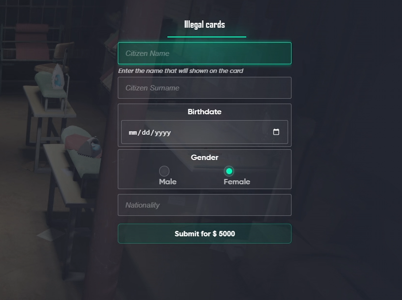
> For the complete documentation index, see [llms.txt](https://fivem.lvsoft.com.ar/llms.txt). Markdown versions of documentation pages are available by appending `.md` to page URLs; this page is available as [Markdown](https://fivem.lvsoft.com.ar/qb-esx/lvs-lib/input-dialog.md).
# input dialog
{% hint style="info" %} Fontawesome is used to add icons to the list items, you can find the code [here](https://fontawesome.com/v5/search?o=r\&m=free).
{% endhint %}
## Context Input
***
## How to use:
Client-side using exports
**Example:**
```lua
exports.lvs_lib:openInput(heading, rows, options)
```
* heading: `string`
* rows: `string[]` or `table` (`array`)
* type: `'text'` or `'password'` or `'number'` or `'textarea'` or `'checkbox'` or `'select'` or `'slider'` or `'radio'` or `'date'`
* options?: `table`(`object`)
* allowCancel: `boolean`
* If false the user will not be able to cancel and close the input dialog until submitted.
* If not defined, the user is able to cancel and close the input dialog.
***
## Field Type Properties
* text / password
* name: `string`
* label: `string`
* description?: `string`
* placeholder?: `string`
* icon?: `string`
* required? `boolean`
* disabled?: `boolean`
* default?: `string`
* min?: `number`
* max?: `number`
* number
* name: `string`
* label: `string`
* description?: `string`
* placeholder?: `string`
* icon?: `string`
* required? `boolean`
* disabled?: `boolean`
* default?: `number`
* min?: `number`
* max?: `number`
* step?: `number`
* textarea
* name: `string`
* label: `string`
* description?: `string`
* placeholder?: `string`
* icon?: `string`
* required? `boolean`
* disabled?: `boolean`
* default?: `number`
* checkbox / radio
* name: `string`
* label: `string`
* options: `table`(`array`)
* value: `string`
* label?: `string`
* disabled?: `boolean`
* required?: `boolean`
* default?: `string`
* select
* label: `string`
* options: `table`(`array`)
* value: `string`
* label?: `string`
* description?: `string`
* placeholder?: `string`
* icon?: `string`
* required? `boolean`
* disabled?: `boolean`
* default?: `string`
* slider
* label: `string`
* placeholder?: `string`
* icon?: `string`
* required? `boolean`
* disabled?: `boolean`
* default?: `number`
* min?: `number`
* max?: `number`
* step?: `number`
* date
* label: `string`
* description?: `string`
* icon?: `string`
* required? `boolean`
* disabled?: `boolean`
* default?: `string` or `true`
* True defaults to current date
* format?: `string`
* Date format to display in the field
* returnString?: `boolean`
* Returns the date as a string, default format is `DD/MM/YYYY`, but if `format` is defined it will use that.
* clearable?: `boolean`
* min?: `string`
* "01/01/2000"
* max?: `string`
* "12/12/2023"
The callback data is promise based meaning that the thread will not continue executing until the user either sends the data or exits the popup
***
## Usage Example
local input = exports.lvs_lib:openInput('Dialog title', {
  {name='field1', type = 'text', label = 'Text input', required = true, min = 4, max = 16},
  {name='field2', type = 'number', label = 'Number input'},
  {name='field3', type = 'textarea', label = 'TextArea input'},
  {name='field4', type = 'date', label = 'Date input', format = "DD/MM/YYYY"}
  {
      label =  "Some Select",
      name =  "someselect",
      type = "select",
      options = {
          { value = "none", label = "None" },
          { value = "other", label = "Other" },
          { value = "other2", label = "Other2" },
          { value = "other3", label = "Other3" },
          { value = "other4", label = "Other4" },
          { value = "other5", label = "Other5" },
          { value = "other6", label = "Other6" }
      }
  }
}{
  submitText = "Submit"
})

print(json.encode(input))
```lua
exports.lvs_lib:closeInput()
```
***
## qb-input replacement
To replace qb-input with this script, you need to enable the functionality in the `config.lua` and remove a comment in the `fxmanifest.lua`
{% code title="fxmanifest.lua (line 59)" %}
```lua
provide 'qb-input'
```
{% endcode %}
{% code title="config.lua" %}
```lua
--- ### CONTEXT INPUT ###
Config.InputAsQBInput = true
```
{% endcode %}